11 Pinterest Pin Image Mistakes
I’m so glad I didn’t calculate the number of wasted hours I spent creating my first set of Pinterest Pin images, because I know the number would be frustratingly high. I still remember the painstaking time it took me to figure out how Canva worked, how to batch create, and creating pins that actually brought eyes to my online content.
If you feel the same way, then don’t worry I’ve got you with this post about the 11 Pinterest Pin image mistakes you should avoid. It will show you what not to do and what to do instead. Ready to stop wasting your time and start streamlining your efforts? Who’s with me??
One of the best ways to learn how to create converting Pinterest pins is by knowing what not to do, so check out the top pin image mistakes you need to avoid from doing:
This page contains affiliate links to products that we have used for our own business growth & enjoyed. Clicking these links does not cost you anything, however doing so will support Upswing. THANK YOU!
Choosing overused Stock images
There are A TON of free stock image websites, and while it’s all good to save some money and utilize the free ones, you want to make sure you’re also using unique ones that most others aren’t using. Otherwise, you’ll find out that your pin images look a lot like other popular pins. Which means you’ll be competing for those Pinterest user eyeballs to get onto your content.
Try signing up for PixiStock or IvoryMix, they send monthly new stock images, which you can also pay for if you want more. Or search different versions of your image topic in those free stock image websites.
A few of my favorite free stock image sites are:
Shutterstock
Pixabay
RawPixel
Pexels
PicJumbo
Ivory Mix
Not Minding your Edges
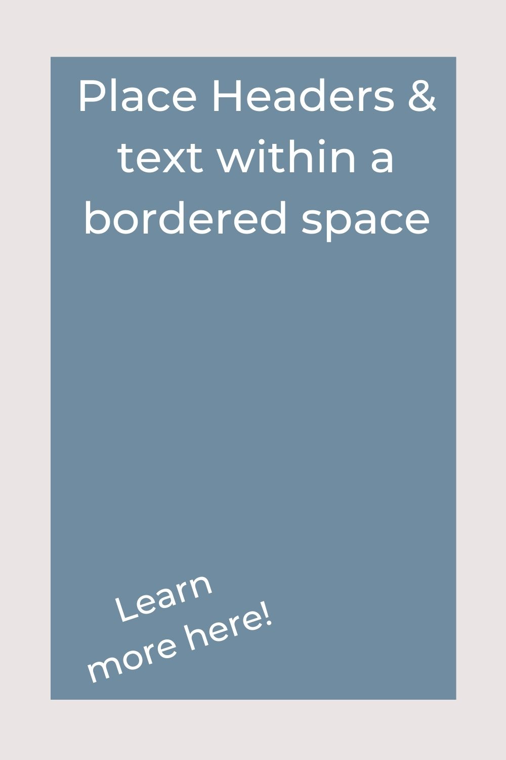
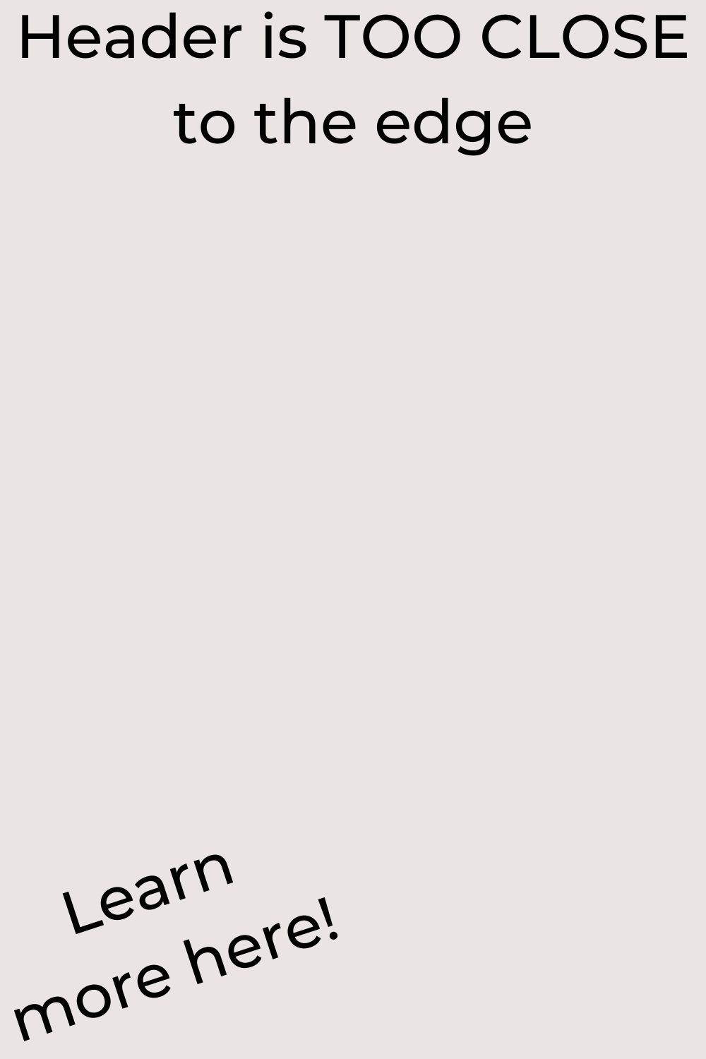
As a beginner pin graphic designer, you want to be mindful of the edges of your image. If you place too many things too close to the sides then it will look sloppy to the Pinterest user.
A great tip to keep in mind is to keep a border on your design while you create it. And tell yourself that you can’t extend beyond that border
‘Pinning ain’t easy’… nor is it light on your workload. We understand how time consuming it is to put together and schedule your carefully crafter pins to Pinterest. Lighten your load by using Tailwind. Our recommended service to plan and schedule your Instagram profile

‘Pinning ain’t easy’… nor is it light on your workload. We understand how time consuming it is to put together and schedule your carefully crafter pins to Pinterest. Lighten your load by using Tailwind. Our recommended service to plan and schedule your Instagram profile
Poor use of text Spacing
Avoid spacing out your pins text. While sometimes it can be okay, if they’re oddly distant from one another it won’t look good and deter users from clicking on your pins.
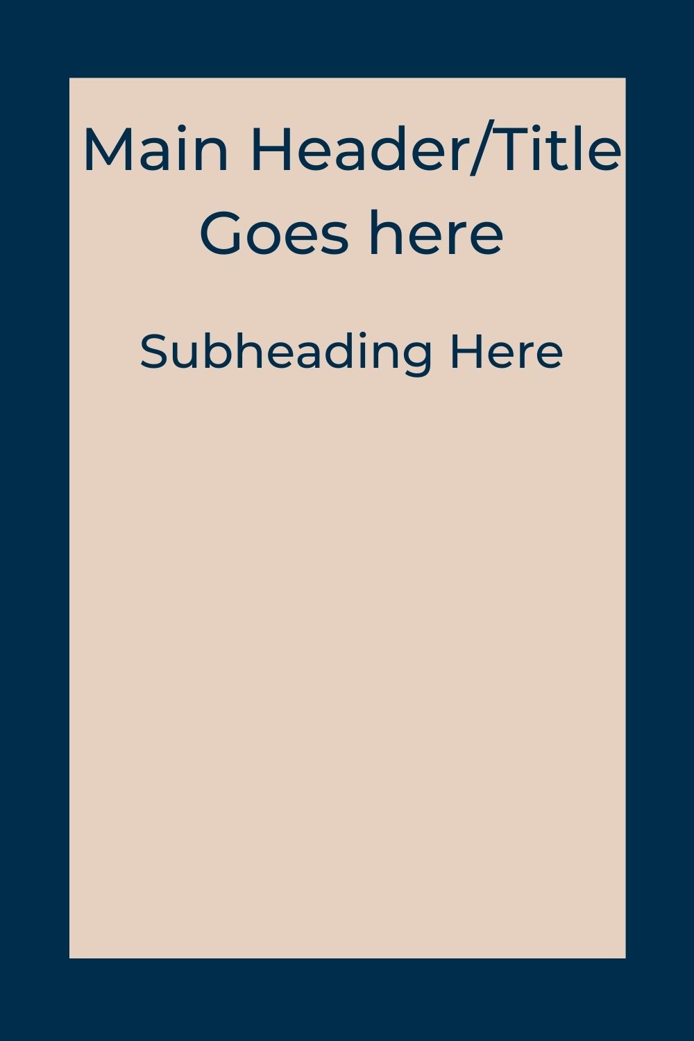
Keep your main heading and subtext close together. This makes it easier for users to read what your pin is about without having to do any eye scrolling work. Sounds silly, but the easier it is for them, the better.
Misaligned Text
Imagine reading a book whose pages were off center just a touch. While it doesn’t make the book illegible, it does make it look sloppy and unprofessional. So the same rings true when it comes to aligning your text on your pin image designs. Canva now has the feature of showing your center on your designs and will show when you align multiple items on the design, so that will help, but it’s not a perfect feature. So, you need to make sure that your text aligns and your pin images look as neat & polished as they possibly can be.
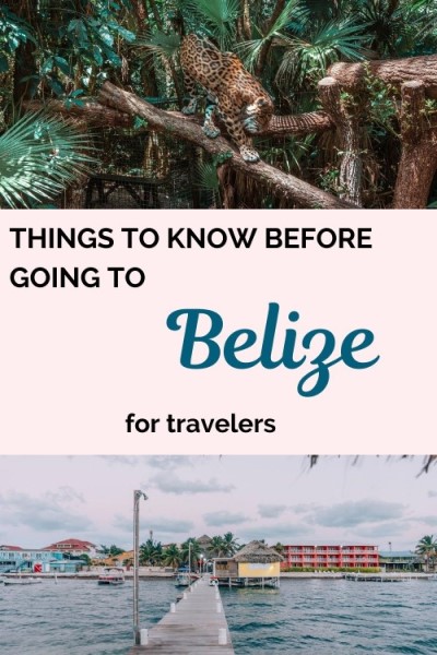

Using Text the User cannot read
If your pin text is too small then users won’t be able to read what your link is about. Think about it, as a Pinterest user you scroll fairly quickly and stop only when you see something that catches your eye and you can easily read what it’s about. If your font is too small, the user will scroll right past your pin.
A great way to test your pin design is to check it on your cell phone! Open up the Pinterest app and see what it looks like from your perspective.
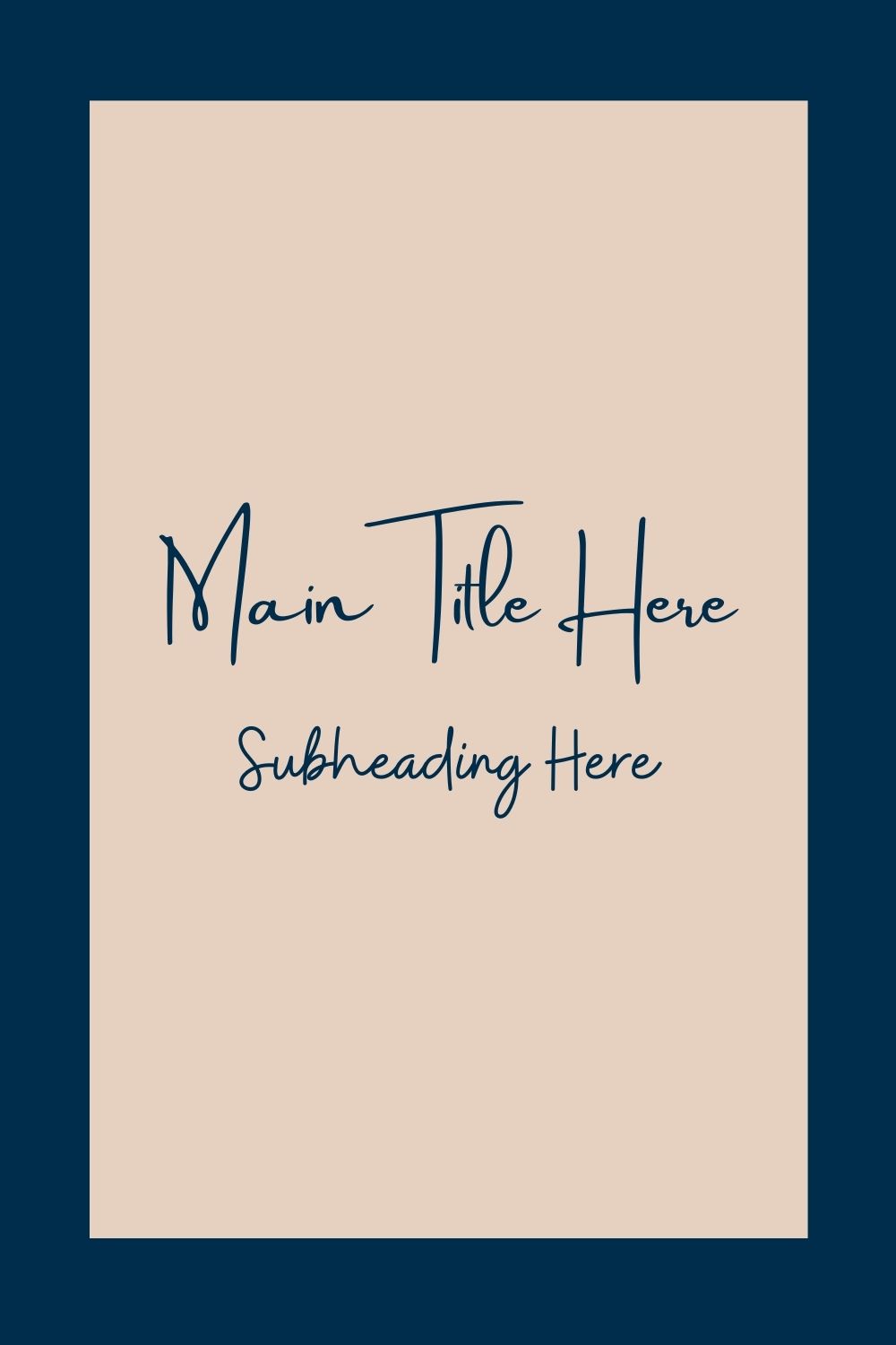
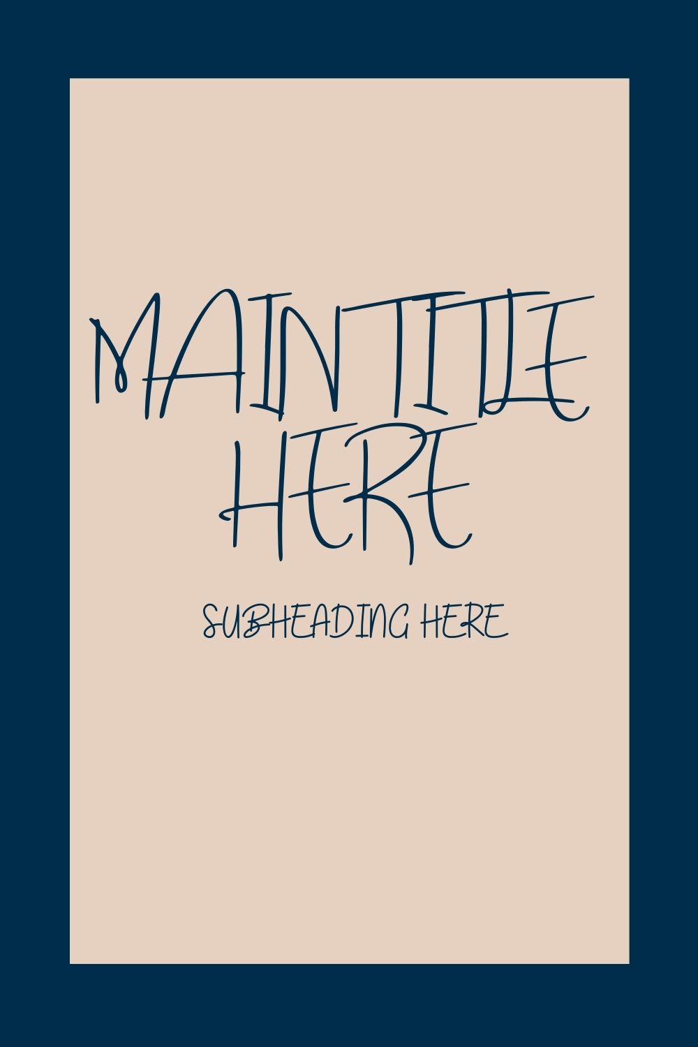
Illegible Script Fonts
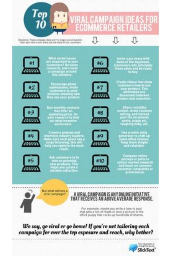
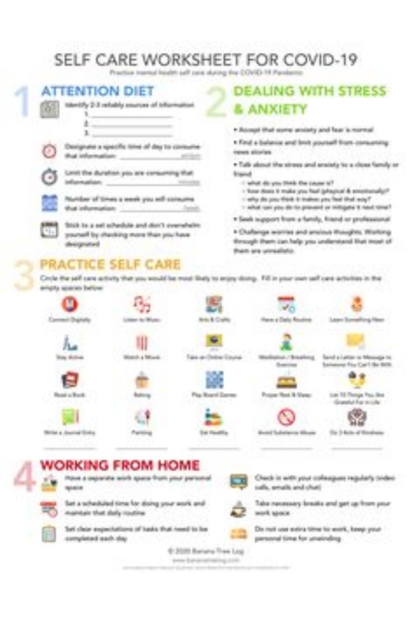
Everyone loves a good looking script font. It adds an element of flair to a potentially bland pin image design. But there is a right and a wrong way to utilize script fonts.
First rule of thumb when it comes to script fonts is to avoid using all uppercase letters.
Second rule of thumb, watch the spacing between the letters. Script fonts are meant to look like one single brush stroke. Similar to your cursive writing style. And if you space your letters too far apart it will look like a jumbled mess. Remember, clean lines are best for ease of reading.
Cluttering your Pin Images with graphics or icons
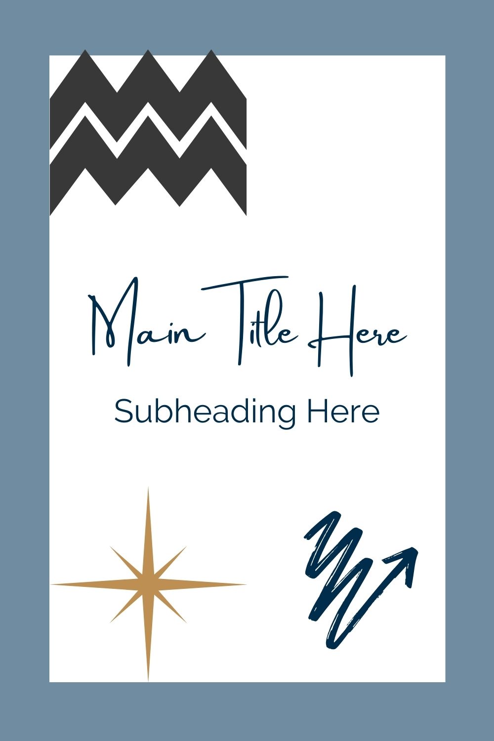
I still remember discovering fun backgrounds we could use on PowerPoint presentations in middle school, and creating absurdly colorful and densely packed graphics onto presentations and then thinking *ah, I’m an artist! Followed by a *chef’s kiss. Looking back now, I think how ridiculous it must have looked to the teacher. But when you first realize there are so many possibilities when it comes to design that you kind of go a little crazy with it.
It’s okay, we’ve all been there – so many graphics, so little time! But we don’t want to overcrowd our pin designs so that Pinterest users are looking at your creations and having the same teacher reaction of ‘what has happened here’
*insert ant man meme ‘what’s happened’
Simplicity is best. You can use additional icons or graphics if it relates to your branding, but for the safe side of things, let’s just say No to extra fluff.
Not utilizing a visual hierarchy
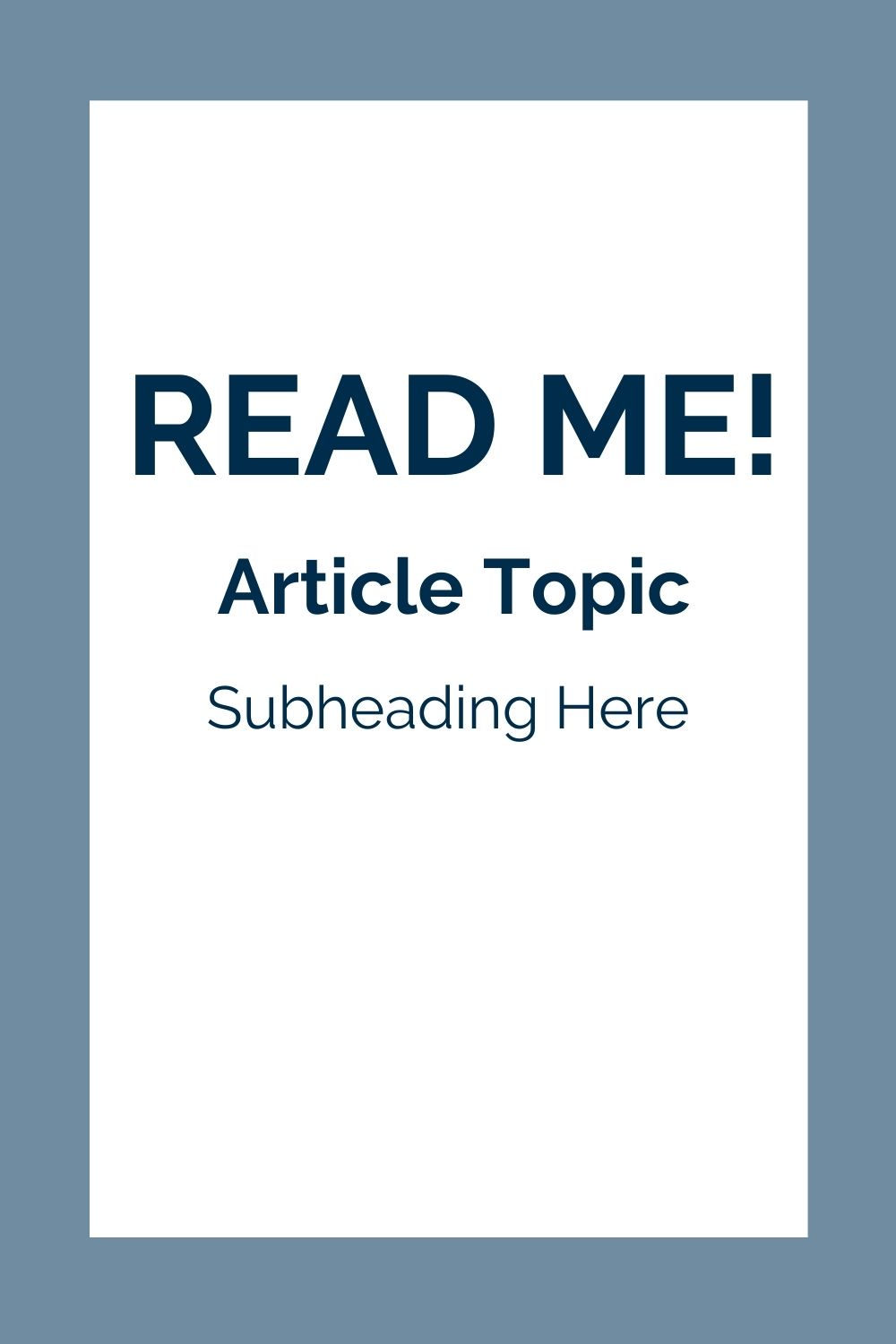
When we say visual hierarchy we mean the visual layout of your pin image and designing it so that certain aspects stand out over others. You want to guide users to easily discover what they’re looking for and pique their interest.
Think of the topic you are creating your pins for – is there one keyword you can highlight that will draw more eyes in? Can you utilize different colors, or letter thickness to denote what’s important? Before you begin designing make sure you know what word(s) of your header you want to stand out.
Insufficient Contrast
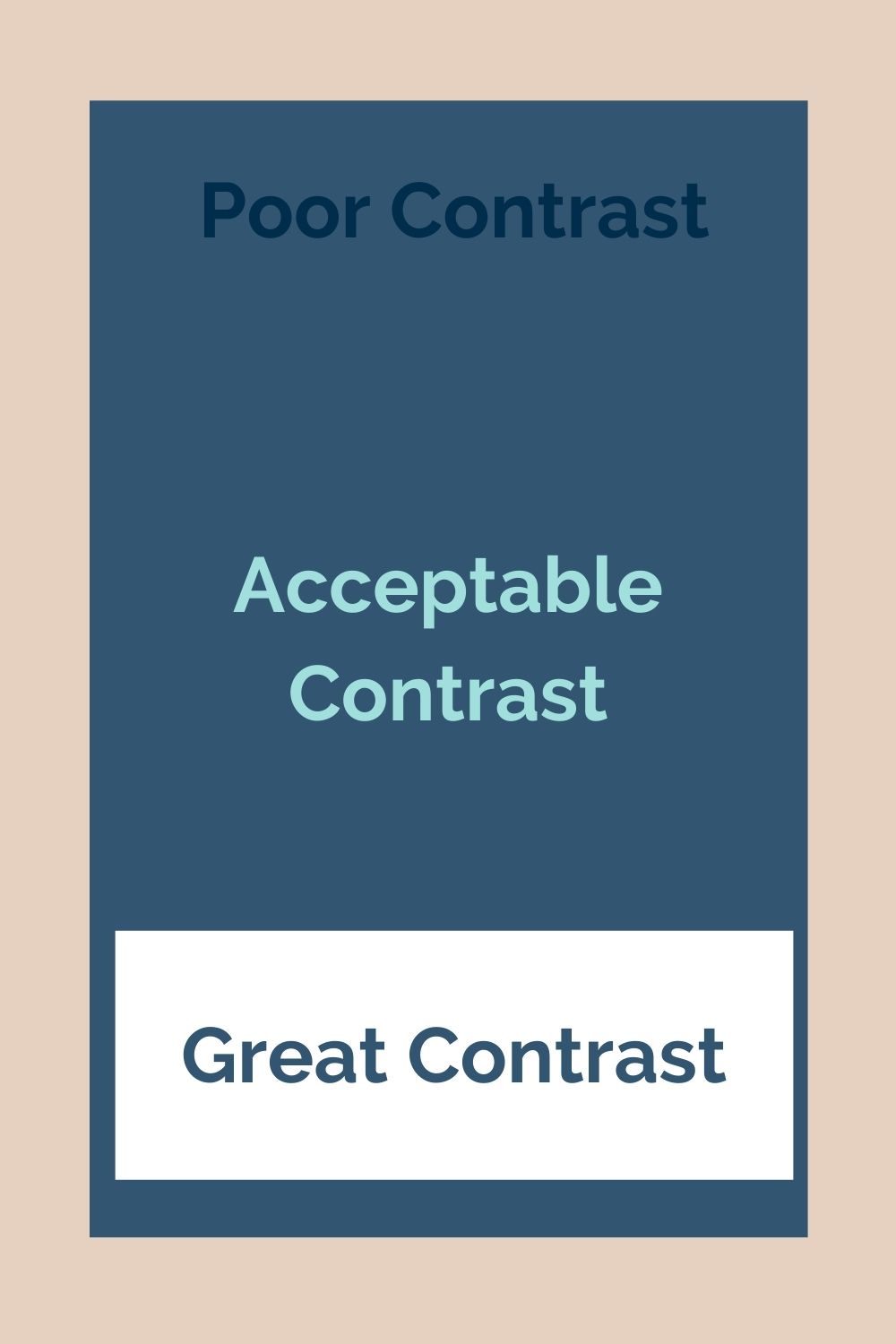
Contrasting colors can be an epic way to receive a ton of link clicks from your Pinterest pins. But if done incorrectly, they can instead have those users scrolling quickly past your designs. If you want to avoid being lost in a sea of millions of pins, focus on your contrast options:
Colors – Avoid colors that are too similar to one another, such as red and orange. Instead choose complementing colors that won’t strain the users eyes.
Size – adjust the sizing of your header & subheader, or maybe use contrasting images that show something from farther away & then up close
Shape & Space – see if you can showcase a unique shape in your design. You could use the same rectangular shape but then include a smaller version, or maybe use a different shape to stand our altogether
Unattractive color combinations
Ever look at a website or maybe a room and see odd colors together that clash? It makes your face cringe and you start to feel uncomfortable, and even try to escape that ‘ehh’ feeling. So we need to make sure the colors we use on our pins are eye appealing. We want Pinterest users eyes to feel ‘ahh so refreshing, I feel comfortable and happy looking at this’, and not to feel ‘ew, I can’t even read this, it hurts my soul’.
Now of course there is a science behind color combinations and what human emotions are felt for different colors, so while the ‘eye emotions’ may need different reactions (i.e ‘Wow gimme!’ or ‘Eek, I need this ASAP’).
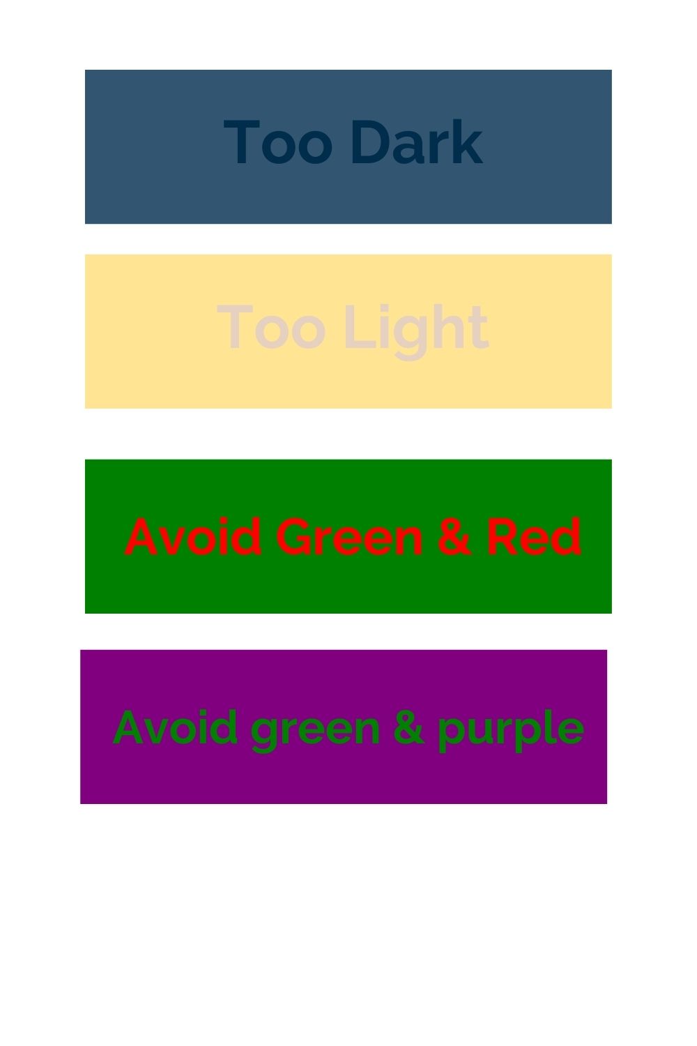
Color combinations to avoid:
-dark on dark
-light on light
-Christmas colors, i.e. red on green
-green on purple (only Barney can pull off that look)
-only neon colors
-only bright colors (remember we want good contrast colors)
CTA can be included & not placing it correctly
If you can utilize a Call To Action in your pin, then do it! It’s a great way to convert Pinterest users to customers/clients/sales. But if you’re going to do it, then you want to make sure your CTA is placed in an ideal spot on your pin image.
We are trained to read left-to-right, top-to-bottom, and our eyes naturally follow a similar ‘Z’ pattern when we look at images. We typically read the top and skim to the bottom right-hand corner. This makes that corner an important place to have your CTA.
